# Import necessary libraries
from dataidea.packages import *
from dataidea.datasets import loadDataset
from sklearn.ensemble import RandomForestClassifierVisual EDA

# Load the dataset
demo_df = loadDataset('../assets/demo_cleaned.csv', inbuilt=False, file_type='csv')demo_df.head()| age | gender | marital_status | address | income | income_category | job_category | |
|---|---|---|---|---|---|---|---|
| 0 | 55 | f | 1 | 12 | 72.0 | 3.0 | 3 |
| 1 | 56 | m | 0 | 29 | 153.0 | 4.0 | 3 |
| 2 | 24 | m | 1 | 4 | 26.0 | 2.0 | 1 |
| 3 | 45 | m | 0 | 9 | 76.0 | 4.0 | 2 |
| 4 | 44 | m | 1 | 17 | 144.0 | 4.0 | 3 |
demo_df2 = pd.get_dummies(demo_df, ['gender'], dtype=int, drop_first=1)demo_df2.head()| age | marital_status | address | income | income_category | job_category | gender_m | |
|---|---|---|---|---|---|---|---|
| 0 | 55 | 1 | 12 | 72.0 | 3.0 | 3 | 0 |
| 1 | 56 | 0 | 29 | 153.0 | 4.0 | 3 | 1 |
| 2 | 24 | 1 | 4 | 26.0 | 2.0 | 1 | 1 |
| 3 | 45 | 0 | 9 | 76.0 | 4.0 | 2 | 1 |
| 4 | 44 | 1 | 17 | 144.0 | 4.0 | 3 | 1 |
Data Distribution Plots:
- Histograms for numerical features (age and income).
- Bar plots for categorical features (gender, income_category, job_category etc).
# 1. Data Distribution Plots
fig, axes = plt.subplots(2, 3, figsize=(18, 10))
sns.histplot(demo_df2['age'], ax=axes[0, 0], kde=True, color='skyblue')
sns.histplot(demo_df2['income'], ax=axes[0, 1], kde=True, color='salmon')
sns.countplot(x='gender_m', data=demo_df2, ax=axes[0, 2])
sns.countplot(x='income_category', data=demo_df2, ax=axes[1, 0])
sns.countplot(x='job_category', data=demo_df2, ax=axes[1, 1])
sns.countplot(x='marital_status', data=demo_df2, ax=axes[1, 2])
plt.tight_layout()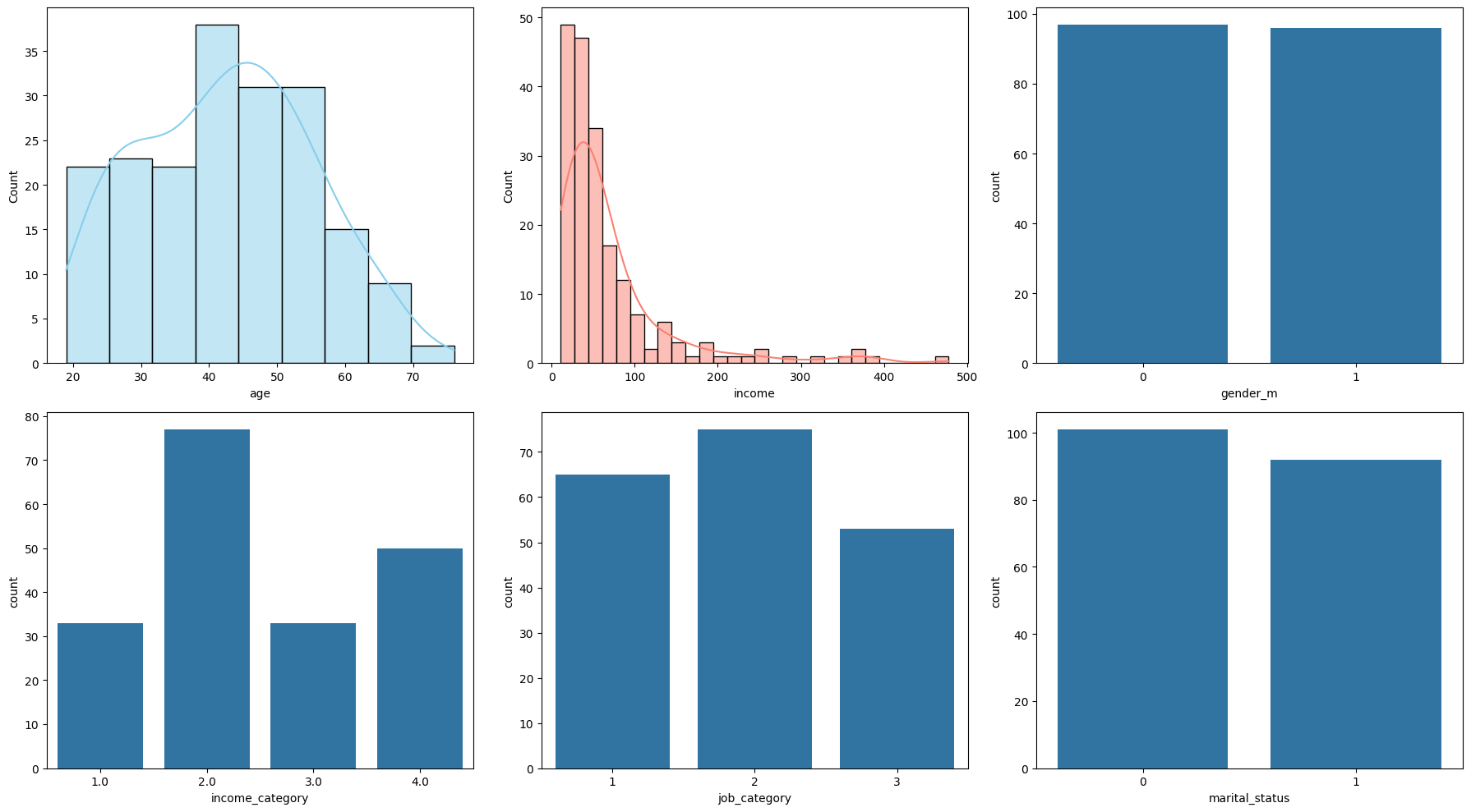
Pairwise Feature Scatter Plots:
- Scatter plots of age vs. income,
# 2. Pairwise Feature Scatter Plots
g = sns.pairplot(demo_df2, vars=['age', 'income'], hue='marital_status', palette={0: 'blue', 1: 'orange'})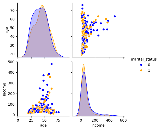
Correlation Heatmap:
- A heatmap showing the correlation between numerical features.
# 3. Correlation Heatmap
plt.figure(figsize=(8, 6))
sns.heatmap(demo_df2[['age', 'income']].corr(), annot=True, cmap='coolwarm', fmt=".2f")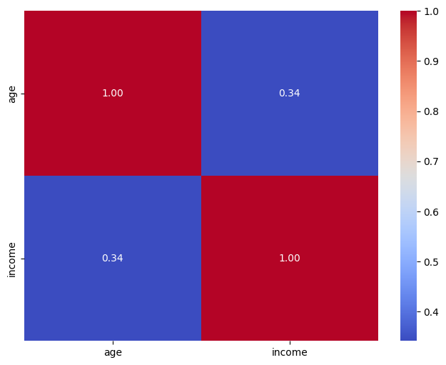
Missing Values Matrix:
- A matrix indicating missing values in different features.
# 4. Missing Values Matrix
plt.figure(figsize=(8, 6))
sns.heatmap(demo_df2.isnull(), cmap='viridis')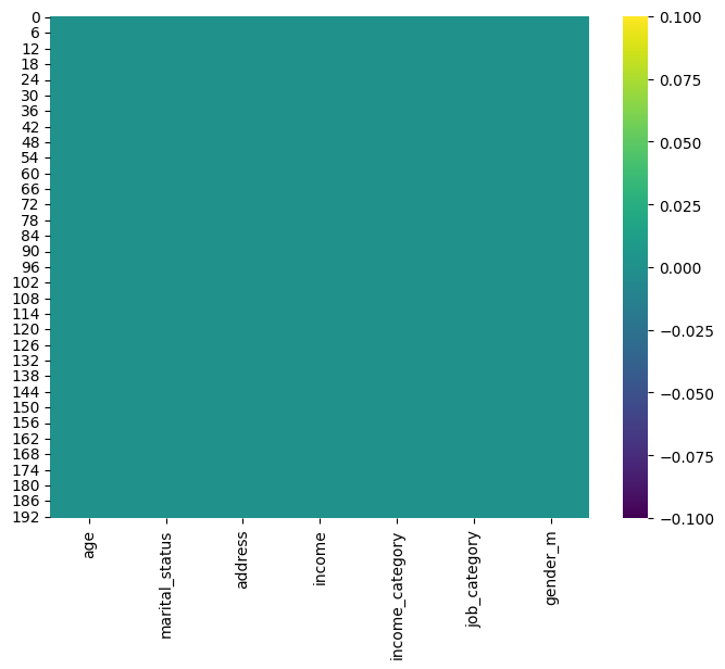
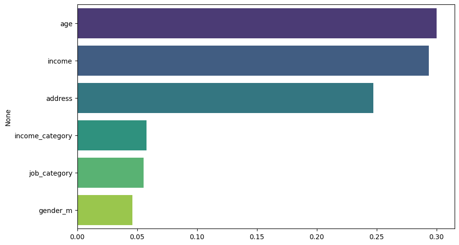
- Feature Importance Plot:
- After training a model (e.g., random forest), we can visualize feature importances to see which features contribute the most to predicting survival.
# 5. Feature Importance Plot
# Prepare data for training
X = demo_df2.drop(['marital_status'], axis=1)
y = demo_df2['marital_status']

# Train Random Forest Classifier
rf_classifier = RandomForestClassifier()
rf_classifier.fit(X, y)

# Plot feature importances
plt.figure(figsize=(10, 6))
importances = rf_classifier.feature_importances_
indices = np.argsort(importances)[::-1]
sns.barplot(x=importances[indices], y=X.columns[indices], palette='viridis', hue=X.columns[indices])

plt.show()